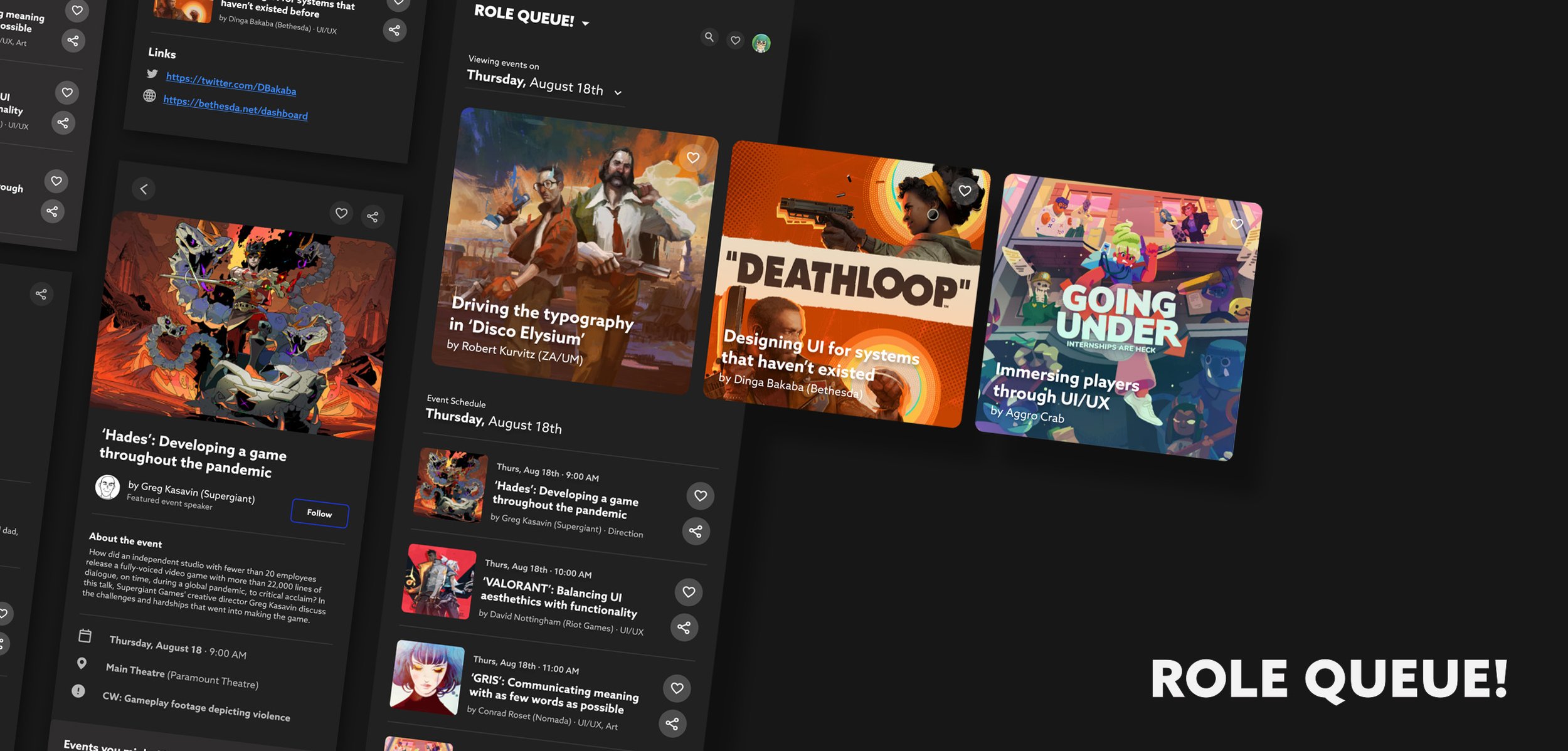
ROLE QUEUE!
Project Year: 2021
Role: UI/UX & Visual Designer
Platform: Mobile App
SUMMARY —
Role Queue is a UI/UX gaming conference focused on bringing game developers together to exchange ideas, get inspired, and have fun! To become better developers, we come together to learn.
ROLE QUEUE!
PROJECT BRIEF
Role Queue is a UI/UX gaming conference focused on bringing game developers together to exchange ideas, get inspired, and have fun! To become better developers, we come together to learn.
OBJECTIVE
The goal of this project was to develop the brand identity of Role Queue, a UI/UX-focused gaming conference. Secondarily, to focus on creating a strong user flow that is clear and readable to users.
CORE STRUCTURE
The foundation of Role Queue’s design system is through its 8-column grid. This allows the app to be information-dense while maintaining breathing room for users.
TYPE & FONT
Role Queue uses a clean and versatile font for its systems. Azo Sans was chosen for its wide selection of character weights which makes it great for building information hierarchies.
COLOR PALETTE
A wide selection of grayscale options was prioritized to help communicate information hierarchies found in its systems. Because the apps functionality is almost entirely limited to viewing schedules and speaker profiles, there wasn’t much need to have extra supporting colors outside of the primary and secondary ones.
BUTTON STYLES
VISUAL DIRECTION
Because Role Queue is a conference focused on the gaming industry, all talks are conducted by industry professionals representing their studios. Key art from their respective games or studios was a focus of the app’s visuals as a result.
FINAL SCREENS
THANK YOU!
Thanks for reading this mini-case study! You can find the full user flow for Role Queue’s app below. You can also find the entire case study for the branding project here.
