

Designing for Discord!
UI/UX Research & Design.
OBJECTIVE
To conduct user research to ideate designs for Discord’s shift to a wider audience. To run user testing to observe usability to further iterate and improve on developed prototypes.
TEAM SIZE & ROLE
Solo: Research, Design, Prototyping
TIMEFRAME
2 months
So… what’s worth redesigning?
Discord, a platform initially built as a platform for gamers to communicate and build communities with one another, has continued to amass millions of users for the purpose of building art communities, school servers, LGBTQ+ spaces, and much, much more.
Many users are joining dozens of different servers — ones for work, study groups, art communities, and more. Because of this change, however, users will need to be able to more effectively separate and organize their multitude of servers, in order to keep track of the various servers and communities they participate in.


Conducting & Synthesizing Research
To get a better understanding of the different types of needs that exist outside of gaming-focused communities, I interviewed seven different users about their experience with the platform. The usage from these users spanned academic servers, music groups, art communities, sneaker-trading, and more. After conducting these interviews, I synthesized my data into two key themes that I would design my solutions around:
1. Versatility
Multi-purpose users that utilize Discord outside of gaming felt that there wasn’t enough in place to cater, browse, and organize the way they interacted with their servers. By introducing new ways for users to personalize and streamline the way they access different servers and chats, we can let users interact with functionalities that suit their needs.
2. User Control
Users who utilized Discord in academic/professional settings felt there wasn’t enough in place to adequately separate such servers from their more personal, recreational ones. This lack of separation led to most users haphazardly creating alternate accounts to avoid certain frustrations, such as public connections on their profile cards. By developing different options for users to tweak the way they interact with the platform, we can avoid such frustrations in the future.


Wireframing Solutions
In sketching my wireframes, I focused on fleshing out five different ideas. These designs were chosen based on their relevance and impact on themes of versatility and user control. These were:
My Saved—A section where users can bookmark channels and DM’s into one, centralized server
Pop-out Chat—A separate, external browsing window built to allow for multitasking
Visibility Settings—A settings page for users to adjust what content on their profile cards is visible
Redesigned Server Folders—A redesign focused on creating an improved separation of server types


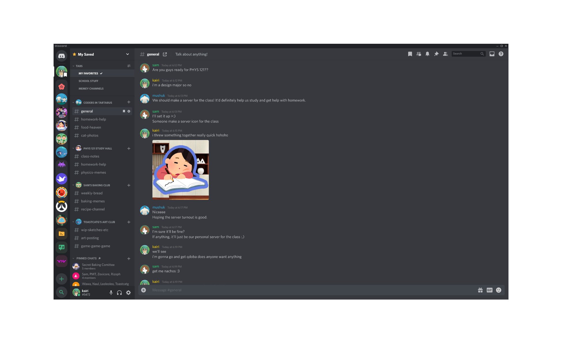
Prototype 1: My Saved
“My Saved” is a dedicated space for users to view their favorite channels and DM’s. Here, users can bookmark chats into different tabs—personal, curated pages that freely allow them to organize their chats as they please. This design was created as a way to allow users to quickly hop between their most valued channels without having to manually skim through their entire library of servers and channels.
Because “My Saved” can hold a large variety of channels across different servers, I wanted to make sure readability was emphasized in its design. To do this, channel categories are instead substituted by their respective server icon, in order to help users quickly understand where these channels are coming from. Direct messages are then presented with their default, unchanged look.
Prototype 2: Pop-out Chat
During my research, I found that 6 out of the 7 users I interviewed preferred to keep Discord on their second monitor at all times. These users claimed that this helped them multitask while being able to keep chats open — whether they were playing video games, writing an essay, or even just watching YouTube — many appreciated the ability to quickly glance over at active chats while they were doing something. However, on single screen setups, all seven users preferred to alt+tab between windows instead of remaining partitioned on their screen. So… why might there be such a stark difference in usage between single and dual-screen setups?
It turns out, that Discord’s current window constraints take up too much space. Because the application tries to keep server icons, channels, and chat windows visible at all times, the client has a hard time squishing horizontally, as opposed to being vertically scaled. This can make multitasking hard on single screen setups, with at least half a user’s screen estate being taken by Discord’s client.
FIGURE: Discord’s Current Constraints (screenshot circa 2021)
This is the client’s thinnest constraints. The channel and server list make up a bulk of its width—so perhaps—if we could condense this content somewhere else, we could give users more space to keep Discord comfortably nestled on a single monitor! The challenge to tackle here, however, comes from the idea that servers and channels are stuck open like this for a reason—its fluidity allows for users to quickly navigate across their servers and DM’s at all times.
Figure: Pop-up chat in action!
A dedicated pop-out chat window allows for a browsing experience that is both versatile and adaptable in a variety of usages. While its functionality is in no way meant to replace Discord’s original, native client—I hope that this allows users to have a different means of interacting with their chats, letting users text comfortably on a single monitor without having to alt+tab back and forth.
Here it is in action! Pop-out chat allows for a window with much thinner constraints—all while mimicking Discord’s navigation patterns users are accustomed to.
Prototype 3: Visibility Settings
A user testimonial that stood out to me during my interviews, was an instance where the user was approached by a stranger from a mutual server they were both a part of. This stranger, having noticed their social media and gaming profiles were linked to their account, began asking them about their hobbies and interests in an attempt to court them. From this awkward, unwarranted interaction, this user quickly realized that this third-party connection on their profile wasn’t exactly something they were comfortable displaying publicly in such spaces.
To help users avoid having to make the choice between removing their connections or leaving themselves open to future unwanted interactions, I wanted to design a way for users to allow the control they needed over their profile cards — primarily, through the use of visibility settings.
This functionality makes use of sliders to change the level of visibility between friends, server members, and complete strangers — allowing for a more comfortable experience where users can pick and choose the things they want to display, to an audience they’re comfortable with.
Prototype 4: Server Folders — Redesigned!
When interviewed, all users who created server folders claimed to use them to categorize servers into different thematic groups. Where some folders sorted servers into academic groups, others folders were used to categorize hobby-focused servers, emoji servers, or even throwaway servers! (Sorry, emoji servers.) A common frustration, however, came from users who felt that the current look for server folders created a visual clutter that made it hard to distinguish folders from one another.
In their current design, their icons are created by clustering the first four server icons into their thumbnail. While users can pick and choose colors for each folder — their current design doesn’t allow for users to fully separate and distinguish the different types of servers they might have for the platform. This problem primarily affects those who use Discord in both professional and recreational settings, where the lack of clear, unambiguous separation between folders iconography could inhibit their ability to comfortably use Discord on a single account.
Upon this redesign, I wanted to help users create server folders that could immediately be identified based on their context of usage. To do this, I added a different option for folder icons—giving users the ability to choose an icon they feel fits best for their folder. I wanted to give users the option between choosing an icon and using their default, native look, in cases where users prefer their original design.
While this is a small redesign to propose, I believe that the current state of server folders could immensely benefit from such a change. The idea of creating server folders with distinct, clear identities helps users comfortably separate different types of server environments that don’t require creating an alternate account. There’s also more we could explore with such a design—perhaps sometime in the future, Discord could let users upload their own SVGs as a nitro feature? Wink wink.